This project is taken from our 6 person 3rd year master's group project which can be found
here
|
Due to the proposed system being an adaptation of several High Value Manufacturing (HVM) concepts,
a centralised interface becomes an integral component, acting as a point from which information is
taken from and fed back to the users. A well-designed UI is also desirable because the system consists
largely of autonomous components and processes, therefore, the users experience with the system
as a whole will depend heavily on the UI and how they interact with it in order to perform tasks.
Albeit a smaller part of the larger system, the user interface performs 4 vital tasks:
|
- Acts as the point of contact between the user and the system itself. As this is a largely autonomous
system, the majority of users will interact with the system by means of the UI. As a result, these
users’ satisfaction with the system depends on the ease and efficiency with which tasks such as
order placement can be performed.
- The user interface is also the medium through which the system relays information back to the
user. As a result, the UI will have to facilitate this feedback loop.
- Factory workers such as line managers and maintenance teams that physically interact with the
system will base their satisfaction on how “easy” and “intuitive” it is to work with,
and the degree of additional effort required to receive the expected results from the system.
- Higher level management whose interests lie in the performance of the factory as a whole will
base their satisfaction of the proposed system on how it affects the productivity and efficiency of
their plant. As the UI is central to how their labor force works with this autonomous system the
effectiveness with which workers use the UI will be under scrutony. As a result, the UI aimed also
to improve workflow and the rate at which tasks are carried out.
|
|
After a proper definition was established, an understanding of the state-of-the-art in user interface
design for industrial applications was needed. Effort was made to become knowledgeable of the types
of interfaces that are available today, and how UIs were designed for industrial plant operators. Doing
this was important as it was found that badly designed HMIs were found to be large contributing factors
to industrial disasters. In order to avoid this, it was found that the general guidelines for an industrial
UI are as follows:
|
- To avoid clutter, users should be progressively exposed to information
- To emphasize important information, the background should not attract any attention
and colours such as red should be used only to display warnings and alerts, whereas green would be
used to display positive information.
- Displays must be consistent throughout, with a gravitation towards 2D elements.
- Immediate feedback should be provided to the user when acknowledgement of an action performed is expected.
- Animations should be kept at a minimum and used sparingly.
- Navigation methods should be consistent, and navigation should involve the minimum number of
actions by the user as possible.
- Processes should flow from left to right much like words in a sentence, in order to reflect the
expectation of users.
|
Requirements |
- Must be robust in order to keep maintenance to a minimum
- Should be scalable, and appropriate for an industrial setting
- Shall allow the monitoring of current processes through the use of the data passed along the
networked nodes
- Shall allow users to interact with the system through a common, intuitive interface
- Shall be a graphical, menu-based interface with a minimum number of windows
- The user interface shall be hosted on localised servers that are stored and maintained in a secure
location. It also shall employ levels of access rights to users, identifying those with a higher level
through an administrative password that shall be assigned by the factory owners
- When processing and storing information, the system shall follow guidelines on information
responsibility through full compliance with the UK Data Protection Act 2018 and the EU General Data Protection
Regulation
- The system should process and display diagnostic data communicated amongst the network of
nodes to the user
|
Tools and Technology Behind User Interface |
|
Initial research was performed in order to be better suited to choose which languages and tools
would be used to implement the user interface. After much consideration a decision was made to
not use Python and instead use a combination of HTML, CSS, Javascript and JQuery. This was
chosen because it was apparent that significantly more support could be found online and in literature
on creating a web-app using these tools. Additionally, creating a website rather than an installable
application had the added advantage of being more accessible, without the need for distribution and
installation across the plant.
Despite having clear requirements at the beginning of the project in terms of what was generally
expected of the UI, specifics regarding the exact structure, content and features of the user interface
were not detailed. As a result, a degree of freedom was available when implementing functionality but
also required that features were added alongside the development of the real system so that the UI
reflected what was truly possible. Therefore, the implementation of the user interface became lean.
A systems approach was still maintained with respect to verifying requirements and validating the UI
against these, but a modular approach was adopted so that updates could be easily and continually
made.
|
|
HTML5 was first used to provide the basic structure to the web pages. A consistent page structure was
established from this stage itself in order to meet the requirement of expandability. Commonly used
elements such as headers, paragraph and anchor tags were used to do this, while using good coding
practices in order to improve code readability. As the UI was part of an industrial Human Machine Interface, it was necessary to register and act upon
user interactions. This was not possible using HTML and CSS alone, so a combination of Javascript
and jQuerry was used.
|
UI Elements and Pages |
|
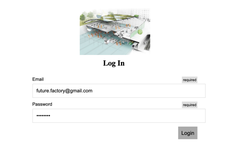
The development of the user interface began with creating the landing page which in the case of this
HMI would be the log-In screen.
|
Landing Page |
 |
|
Despite being minimal in appearance the web app implemented other features within the code that
are not immediately evident. For instance the functionality for users to save email addresses and their
associated passwords was added in order to reduce time taken by users when repeatedly filling in the
same form before moving on to the task at hand. Additionally, information alerts were used to notify
users that incorrectly entered their email by providing the required format. These features were added
in the hope of increasing the ease of use and speeding up workflow when performing repetitive tasks.
All other pages were made with the aim of being consistent with this design.
|
Menu Page |
 |
|
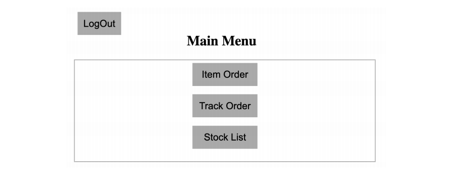
The user is immediately made aware of the continuity when progressing to the main menu.
Similar to the log in page main content was aligned with the center of the screen in order to focus the
user’s attention and activity to a smaller location in the hopes of increasing efficiency.
Here, the main focus when creating this page other than being consistent with the overall design strategy
was to implement modular design. This was done by defining several classes using CSS within style
tags in the HTML code.These classes included form buttons, form submit and page title. For each
of these classes, properties such as absolute/relative position, font family, width, height, padding etc.
were defined. These allowed additional pages as well as other elements such as buttons and forms
to be easily added in a modular design as part of a lean implementation alongside the development
of new functionality in the real system. An example of a task page that can accessible from the main
menu is the Item Order page.
|
Item Order Page |
 |
|
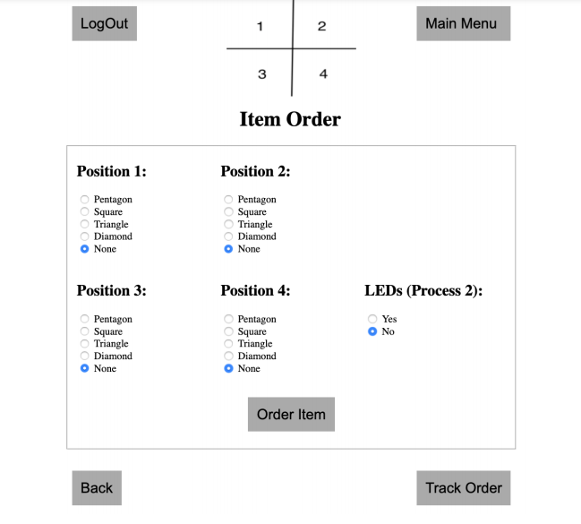
The item order page required effective communication of information to the user such that
he/she understands the information that is required to be entered. The next step was to design form
elements that would collect data regarding the user’s preference of order properties for each of the
processes used in the final demonstration. This involved having the user choose which of the four
shapes would be drawn at 1 of the 4 positions on the work piece. Additionally, the user would have to
choose whether or not to execute the second process in the demo. In order to aid user understanding, a
combination of a single image and careful positioning of the radio button groups for each of the positions
such that they corresponded with those in the image was used. Also, the choice to execute process 2
was placed apart from the choices for process 1
|
|
Once the user has placed the order, the web app sends this information to the control node using
ROS. To enable this communication via ROS, a Javascript package called roslibjs was used. Using
roslibjs, a connection with the computer hosting ROS over the default port 9090 was set up.
Once a connection was established, the web app was able to create a new topic,
“/ordered_item”, to which all orders could be posted to for the control node to access.
|
|
For instance, if the user chose to draw a Pentagon, Triangle, Diamond and Square in positions 1-4
respectively and also requested that process 2 was executed, he/she would select these options and
click the “Order Item” button. This calls the “itemOrder” function where the a jQuery call would find
all input elements of type radio button, determine which choice was made for each grouping (using
element IDs) and then feed the values of these choices into an array. The array elements (strings)
are then sliced to extract the information and concatenated with additional information such as the
user’s email, length of command data and checksum that is defined by the projects’s communications protocol.
This packet data is then submitted to the “/ordered_item” topic, which the control node is a subscriber to.
In order to show to the user that his/her button click and form submission has been registered and acted
upon by the system, Javascript is used to alert the user that the order has been placed, along with a
breakdown of the properties chosen:
|
 |
|
By attaching the user’s email to the packet data, the system is able to associate each order with the
user that placed it and thereby enable order tracking on the website as well as on the RFID tag attached
to each workpiece.
|
Track Order Page |
 |
|
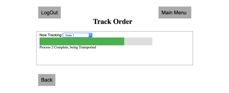
The Track Order page is accessible from the Main Menu. However, with the aim
of improving workflow in mind, it was decided that a button to navigate to the Track Order page should
be placed on the Item Order page itself. This improved usability and overall experience by allowing the
user to transition directly to the next step of the ordering process rather than having him/her go through
the Main Menu. Care was taken to position this button on the right side of the screen, creating a visual
cue that this was the next step in the process. Once again, these cues were part of intuitive design
principles being implemented to ultimately decrease the training necessary before users can use the
system.
The order tracking page is an example of how the user interface is a useful component of
the system when it is necessary to feedback pertinent information to the user. In this case, the user
receives updates on his/her order in real time from the factory floor. Through this page, users have the
ability to track multiple orders simultaneously in the case where more than one order was placed by the
user. This real time tracking was made possible by having the UI node subscribing to an “/order_tracker”
ROS topic that would be posted to by the control node as it received updates from other processing and
transport nodes on the factory floor. This feature not only allows the feedback of information to the user,
but also has the potential to increase worker efficiency and productivity as he/she no longer has to be
present on the floor or at a particular machine simply to know what is happening. Because the web-app
can be accessed anywhere within the factory over the intranet, the worker now has the advantage of
starting and receiving updates on a process from his/her work desk while performing other tasks.
|
